To find out more about my audience and their views on websites I added polls to my blog and asked people to answer them.
Not very many people answered this poll even though I posted links on the social networking site Facebook which was the same method I used to collect my other audience feedback.
In all, 16 people answered the poll.
87% who answered were aged 16-21 with 12% aged 28 and above.
43% said that they would visit a film's website because they had seen the trailer. This would be to gather more information on the film and the actors.
25% said the reason why they had visited a film's website was because they had seen a poster promoting the film, 18% said they would visit a website if they had seen the film promoted in a magazine and 12% said that they wouldn't visit a film's website at all.
81% of those who answered the poll said that a website was a good promotional tool for a film although only 6% of those who asked said that they very often visited websites promoting film's but 56% said they sometimes visted the websites.
62% said that a website with the main focus on the trailer would be more beneficial to promote the film and 43% said that information on the film and actors would also be beneficial to the promotion of the film. Only 2% said that extras such as games, activities and downloads would be beneficial.
With this feedback I know to include a main focus on the trailer and information on the film and actors and I can also see that the trailer would be the main reason the audience would visit the website.
This may mean that I should include a fictional website address for my film on the trailer if I have time to go back and edit.
Using the feedback and the codes and conventions I found when conducting my research I will be able to create a website that will look authenic.
Saturday, 27 February 2010
Wednesday, 24 February 2010
Web Page Analysis
Valentine's Day Official Website

This style, positioning, location at the top of the text and colour used in the title and the names of the actors in the film is a coherent link which is also used on the poster promoting the film.

There are more navigational links in the red circles providing the audience with options and downloads relevant to the film.
Here are some more interactive links in the white links. These link to other sites like Facebook. This can be a free promotion because creating a group on Facebook is free and available to everyone who has an account.

The images and title are coherent with that of the posters I analysed earlier in the blog. They are the main focus on the site as they are the first thing that draws the eye. The style of the images are also the same ones used and in the same layout style as the poster.

This style, positioning, location at the top of the text and colour used in the title and the names of the actors in the film is a coherent link which is also used on the poster promoting the film.
However, there are some interactive links like the speaker icon in the light blue circle which plays the soundtrack from the film. In the white circle there is also a navigational link that takes you back to the menu page. This convention also allows the website to have other features that wouldn't be available with the trailer, magazine front cover or the poster.

There are more navigational links in the red circles providing the audience with options and downloads relevant to the film.
The images in the yellow circles are animated and change as the graphics move across to show more links. The images are that of the actors in the film and are relevant to the plotline which follows the lives of different people on Valentine's day.

Here are some more interactive links in the white links. These link to other sites like Facebook. This can be a free promotion because creating a group on Facebook is free and available to everyone who has an account.
The logo of the production company is also featured in the blue circle which is another convention.
In the orange circle there is another interactive feature which allows the audience to control what music from the soundtrack to listen to as they navigate through the site.


This is another coherent link between the three texts; website, trailer and poster as the billing block is featured on all of them. This lists the actors, director, producers and others involved in the production of the film including the logo of the production company.
In the pink circle there is the certificate of the film which is featured on all of the texts too.
500 Days of Summer Official Web Site

The images and title are coherent with that of the posters I analysed earlier in the blog. They are the main focus on the site as they are the first thing that draws the eye. The style of the images are also the same ones used and in the same layout style as the poster.
In the red circle is the navigational sidebar which contains a link to the trailer and an interactive option 'Make your mixtape'.
In the pink circle there is a music player that contains the soundtrack of the film and allows the audience to control what they listen to as they are on the site.


In the red circle, the trailer of the film plays automatically as the audience goes onto the page. It is the main focus of the page and keeps the audiences attention.

This is featured at the bottom of the page and contains copyright information with links to the 'Private Policy' and 'Terms and Conditions' of the film and production companies.
The Proposal Official Web Site

In the red circle, the trailer of the film plays automatically as the audience goes onto the page. It is the main focus of the page and keeps the audiences attention.
In the green circle there is a coherent image of the two main actors which will help the audience associate all of the promotional texts to the same film.
In the blue circles there are the names of the main actors, a heading of the status of the film and the billing block. These are also coherent with the other promotional texts. These contain information for the audience.
The title is also a coherent feature that links the promotional texts of the film, as well as the colours used on the background and the text.
In the turquoise circle, there is a link to the synopsis of the film to further tell the narrative of the film.
In the turquoise circle, there is a link to the synopsis of the film to further tell the narrative of the film.
This site differs from the others as it has no navigational sidebar. It also has a simple layout so that the audience isn't overwhelmed by images, colour or focus.

This layout is simplistic with the main focus on the images in the centre of the page which are separated by a Christmas style bow so that it all resembles a present.
The images are taken from the film and apply some tone for the film.
The title is coherent with the other texts used with this film. It is also centred at the top of the page which follows the conventions of websites.
The navigation is featured on the bottom of the page in the purple circle and provides three options for the audience which includes a link to the trailer. This is also a convention of websites.
It also includes information on the film so the audience knows when they can go to the cinema to see the film, or buy it on DVD.
Conventions of Homepages for Films
Film websites are produced as another promotional technique used. The website usually continues the coherent themes in the film trailer and poster so they are all associated with the same film.
Websites are easily accessible by anyone so in theory, it could reach a wider audience or if the audience is made curious by a poster and wishes to find out more about the film.
The website of a film will usually contain more information on the film as well as extras like a photo gallery or games.
Typical conventions of a film's promotional website are;
Navigational sidebar: Nearly every website has a main menu. The navigation between the pages on the site must be easy to read, find and use so the consumer knows how to navigate around the site and the linking pages.
Links: The links help the consumer go from one page to another on the site. It will also help organise information and separate the different sections of the site.
Streamed video of the trailer: Some film homepages have a trailer that plays automatically as the consumer comes to the page. They may also have a link to other videos from the same film.
----------
Sources:
http://www.usereffect.com/topic/25-point-website-usability-checklist
Websites are easily accessible by anyone so in theory, it could reach a wider audience or if the audience is made curious by a poster and wishes to find out more about the film.
The website of a film will usually contain more information on the film as well as extras like a photo gallery or games.
Typical conventions of a film's promotional website are;
Navigational sidebar: Nearly every website has a main menu. The navigation between the pages on the site must be easy to read, find and use so the consumer knows how to navigate around the site and the linking pages.
Links: The links help the consumer go from one page to another on the site. It will also help organise information and separate the different sections of the site.
Streamed video of the trailer: Some film homepages have a trailer that plays automatically as the consumer comes to the page. They may also have a link to other videos from the same film.
Colours (text and background): These are consistent with the other promotional texts of the film and will usually be an adequete contrast between the colours so the text and images are easy to see and it doesn't hurt the audience's eyes.
Font: This is also consistent with the other texts and will also be easy and simple to read.
Title: The title is a consistent feature of the film and so will be the same to link all of the texts together.
Images relevant to the film: Some of these images will also link with the other promotional texts, for example, the same picture from the poster may be used on the website homepage.
Flash, add-ons and animation: Usually there are moving images on the website which aren't available on the poster or front cover. This will be to differ slightly but the images will be the same, just animated.
Production company logos and billing block: These are a coherent link between the promotional texts and are usually found at the bottom of the homepage.
Headings of actors names: Like the posters and trailers, the homepage will also promote the actors in the film.
Tagline: Another coherent feature that links the texts together but the tagline could be animated so if the film has more than one tagline, they may scroll across the screen one at a time.
Release date: The website usually stays up even after the DVD release of the film as it will then promote the DVD.
Soundtrack information: Either through a link or a music player on the website, the soundtrack will usually be featured on the page.
Streamed music from the soundtrack: This allows the audience to hear music from the film which can also help set the tone of the film. Usually music is featured on the comedy and romance genre although action genre or the horror genre may have eery music playing on the site as the audience navigates through.----------
Sources:
http://www.usereffect.com/topic/25-point-website-usability-checklist
Thursday, 18 February 2010
Homepage for the Film
I am unable to make my mind up about whether to make a homepage for my film or to make a magazine front cover as my secondary ancillary text so at the moment I have done research on both of these media texts.
I have no knowledge of making homepages or websites so making a homepage will be completely new to me which is why I'm doing a practise draft now rather than choosing to do a homepage and not having any idea how to better it.
To do this, I will be using the google site creating website.
This is my first attempt:
This site doesn't really give me much freedom as you can see with the layout and the images. I also don't have much freedom to adapt the layout and colours so would probably have to work around the homepage colour scheme and replicate the style onto my other ancillary text.
However, I began to research on the internet and found a site called http://www.wix.com/
With this site I will have more freedom and editing will be simpler to make. So when I begin to create the homepage for my film, I will use this software as it is easily accessible on the internet so I will be able to work from home and college, which I wouldn't be able to do if I created my homepage on Dreamweaver software because I don't have it at home.
----------
Sources:
Film Front Cover
I have decided to make a website homepage rather than a magazine front cover. This is because in the AS coursework I made a music magazine front cover and so wanted to try something different.
Wednesday, 17 February 2010
Audience Research on Film Magazine Front Covers
From the research conducted through the use of secondary sources and analysis, I found that film magazines tend to be aimed at a male audience.
Action, horror and fantasy films are more likely to be featured on the front cover of film magazines rather than a romantic comedy. This may be because the target audience for romantic comedies tend to be women which differs from the target audience of film magazines. 

From the image on the left from Empire magazine's website, you can see that there is a choice of covers with this issue. Both action films. The general layout, colour and language used in the website and magazine is also representative of a masculine ideology.
Because my film is a romantic comedy, the use of a magazine front cover as a ancillary text wouldn't fit in with the conventions of film magazines. Although I could create a film magazine front cover with my film as the main focus to de-construct the usual conventions, the ideology behind it wouldn't be right as the main audience of film magazines are male who are not the target audience for my film. This is why a website would be better as a promotional tool as women are more likely to use the internet to research and find out more information about a film they want to see.
Romantic comedies are usually promoted through magazines with the use of adverts within the magazine or through interviews with the actors or actor in the film. 

For example, the image of the popular womens magazine 'Glamour' has Jennifer Aniston on the front cover.
In the month the magazine was released, Jennifer Aniston's film 'Love Happens' was released.
Tuesday, 16 February 2010
Front Cover Analysis
Total Film Magazine - Promotional Cover for King Kong (October 2005)

The masthead 'Total Film' is iconic for the magazine in the way that it is recognisable even if partially covered by an image or text. It follows the convention that the masthead is at the top of the cover and stands out so the audience would be able to recognise it on a shelf. The masthead contains the noun 'film' which suggests the ideology and representation of the magazine is film based.
The colour scheme of the front cover is mainly greys which the yellow headlines stand out from. With this colour connotation, the audience can recognise the genre of King Kong as an adventure thriller with romance which can be seen through the image.
The headline 'King Kong' is in a different colour text to the subheadline like the others to the right of the page. This stands out and the headline 'King Kong' links to the main image as they are the stars of the film. The image is of the actors as their characters which can be seen through the clothing they are wearing and the acting.
The features usually found on magazine front covers which include barcode, issue number and date of release and publisher logo are on the Total Film cover.
The image is a two-shot with the two main human characters of the film.
Total Film Magazine - Promotional Cover for Alice in Wonderland (March 2010)

In the masthead, the fact that part of the title 'Total' is inside the other 'Film' emphasises the noun film, making it look more important. This is the genre of the magazine and the main representation.
The pull quote 'Free giant Iron Man poster!' is a promotional device to entice consumers to buy the magazine as it is a unique selling point.
The image is of Johnny Depp dressed as the character 'The Mad Hatter' from the new Tim Burton adaption of Alice in Wonderland. The character is iconic of the story and the rabbit he is holding is also iconic of the story, Alice in Wonderland.
The main image is a medium shot and shows most of the characters clothing which is representative of the film.
Alice in Wonderland is one of 2010's highly anticipated films which has been promoted since Summer last year.
The colour scheme also links with the film. The purple connotes the idea of curiosity and madness which are both iconic of the plot of Alice in Wonderland.

On this front cover the masthead differs from that of other Empire front covers. The lettering of the title is on fire which directly relates to the main image and film article in the magazine. The character on the front cover, Hellboy, is from Hell and so the fire is a representation of that. The dark colours and bold red connote Hell and danger.
The image is a medium-close up shot of the character. This is conventional of magazine front covers and shows the main character.
The main headline links with the image as this is the main feature of the magazine. The subheadlines are of films in the action, adventure, thriller, horror and fantasy genres which the male audience prefers.
The headlines are all in the same font and the subheadlines are also in the same font which uses continuity.
Empire Magazine - Promotional Front Cover for Public Enemies (2009)

The main image is a medium shot of the main character from the film 'Public Enemies' which links the the main headline 'Public Enemies' and the subheadine 'Johnny Depp Steals Summer!'. The headline and subheadlines curve around the image. Down the right hand side of the cover there is a column of images that relate to upcoming films of 2010 which relates to the headline 'First look' and 'Heroes of 2010'. The headline 'first look' provides an unique selling point and the Harry Potter exclusive also provides an unique selling point.
The other images of films relevant to the subheadline are all images from the films they are representing. These are smaller than the main image so they don't take away emphasis from the main article within the magazine.
The main image of the front cover differs from the others I have analysed the character is not looking out of the magazine. This might be because the image has been taken from the film rather than a promotional shot. The blurring of the background of the image suggests this and the fact the character is surrounded by smoke or exhaust fumes.
------------------
------------------
Sources:
Textual Analysis of Film Magazine Frontcovers
Language- The language in the written texts of film magazines usually contains jargon related to film and media. Language could also mean the style and colour of text in order to emphasize a particular article in the magazine.
Institution- The institution will be the publisher of the magazine. Future PLC is the publisher of Total Film magazine.
Ideology- The ideology of film magazines are to promote films, directors, actors and production companies. Film magazines usually review upcoming films as well as features on different films and actors.
Audience- The audience of film magazines are usually people who are fans of films and actors. The target audience are 18-35 year olds and usually are mainly male orientated. Many of the covers are of highly anticipated films, most of which are action, adventure and thriller based genres although the cover of the June 2008 issue was Sarah Jessica Parker who starred that month in the new and highly anticipated 'Sex and the City' film which was in the romantic comedy genre.
Representation- The films, actors, directors, writers, production companies and film festivals are the main representation of film magazines. The representation is in the form of images from the film and reviews of that film which help persuade audiences to see the film.
Usually, the images on the front cover or the main article is from the most talked about or highly anticipated film of that month.
The usual conventions of a magazine front cover are;
- title
- headline
- subheadline
- date line
- main image
- additional images
- barcode
- pull quote
- masthead
- issue number
- logo of publisher
- price of magazine

----------------------
Sources:
Monday, 15 February 2010
Production of Poster
Draft #1
I began with the images I had taken from the photo shoots and edited them as seen in the previous post. I then adjusted the size of the images to fit a poster and adjusted them when needed.
This is the first draft of the poster. As you can see I have kept a coherent link with the title and the colour scheme of rosy pinks which reflect the genre.

This is the second edit of the poster. As you can see I have added more conventions that have also been used in the posters I have analysed like the actors names, a quote to help persuade the audience to see the film and an additional image to show the storyline of the film.


With the billing block, I used a similar font to that which is used on film posters and adjusted the font size so that the names were the largest text, in order to replicate that of a real billing block.
On my poster, I lightened the colour of the text so it didn't stand out as much as the rest of the text and images. This is to follow the conventions of a typical film poster and not draw attention away from the main images or the title.
On my poster, I lightened the colour of the text so it didn't stand out as much as the rest of the text and images. This is to follow the conventions of a typical film poster and not draw attention away from the main images or the title.

Analysis of Poster #1
The size of the poster and portrait format would mean that if this poster were to be used it would most likely be seen at bus stops or in a magazine or newspaper.
The genre of a romantic comedy is represented in the main colour of the poster, pink. Pinks are stereotypically used to represent love and romance. The blue in the left hand heart however, is used to represent the character Alison's feelings towards the main character Tony. The blue is to help represent the fact that she hates him and could also suggest she is the antagonist within the film. The other heart however has a sepia colour used to empathise the fact that Hannah is a memory and to continue a coherence with the style used in the trailer which uses a slow motion effect to symbolise the past. Both hearts are set behind the main character to symbolise the past loves of the main character Tony. The hearts also suggest the relationship of the women to the main character, Tony. The connotation behind the colours of the hearts creates an emphasis, for example, the sepia heart is a warmer colour and the blue is a cold, foreboding colour in comparison.
The main image is of the main character Tony. The acting by the character suggests a decision needs to be made as the expression on his face is of confusion or indecisiveness. The character is also looking into the camera so it looks as if they are looking at the audience. This is a typical convention of images used in romantic comedies.
The title is coherent with the trailer and will be coherent with the website homepage.
Another convention I found in my research that I used on my own film poster was the billing block. It's the same billing block I used in my trailer just adapted to fit in with the conventions I found. The text in the billing block is lighter and the text smaller so that it doesn't take much of the audiences attention from the main image or the title.
Draft 2

Analysis of Poster #2
In this poster, the format is landscape which would suggest it could be used to advertise on a billboard or outside a cinema in the poster cases.
The poster has many similarities with the other, for example the style of the text used in the title, the names of the actors, the billing block and the hearts. Although the hearts are flipped to face the main image of the main character, Tony.
Similar forms are used in both posters; the images, the title, the billing block and the colour pink which is representative of the genre and storyline.
The images provide a narrative in the postitioning, colour and character performances. The main image which is centred on the poster suggests that Tony is the protagonist and the narrative follows him. The image of Tony looking thoughtful tells the audience that he will be making a decision in the film and as he is also looking towards Hannah, the audience will associate it as being a decision on her. The colour used which is to reflect sepia as a representation of a memory suggests that Hannah is someone in Tony's past and because the heart she is in is not touching Tony suggests that she may be out of reach This represents the storyline well as it shows that the main character will be going on a journey to find her.
The other heart, which is a blue and contains his wife Alison, is set slightly behind Tony and he is not facing it which suggests she is the antagonist and an ex or current love who he is leaving. The colour blue represents this well as it suggests a cold and icy relationship.
Other conventions used in this poster which I found when analysing existing products are the names of the actors in the film, billing block, title which is a coherent link between the texts and a tagline.
Photos for Poster
With my draft, I need a medium shot of the main character and two medium shots of the antagonist, the ex wife, and the 'one that got away', Hannah.


With this photo, I also used the method I used with the other photo to make the eyes stand out.
I also lightened the shadows the nose and chin
Sources:
------------------------------------
http://www.youtube.com/watch?v=-kIkarvhoa8
These are a collection of the first photographs I took. The lighting was too light in them and so washed out the actors faces and made them look pale. The poses are similar to the ones I want to use for my poster and website but I need to take better and more flattering shots.
Because there were so many I have had to take a selection of them, otherwise there would be several pages of photos and brief descriptions of each one.


These are a few shots from the second photo session. I had a model light here and so this time, the lighting didn't wash out the actor's faces.
With these images of Janey, the one playing Alison, I began to experiment on photoshop.


Above is the original image and below is the Photoshop edited image. As you can see there is a lot of difference as I experimented with colour and modified the colour curve of parts of the image to enhance and lighten the colour. I have also used the clone stamp tool to lighten the skin underneath the eyes.


When editing this photo I used the Clone Stamp Tool to lighten the shadows around her eyes and the area above her right cheek.
I also used the Lasso Tool to highlight the blue in her eyes. This was to make them look more defined. First, by making the selection with the Pen Tool, I rendered the eyes and modifyed them by using Feather set at 3 pixels. I then adjusted the colour by adjusting the Colour Curve and setting it so the eyes were a deeper and bolder blue. After that, I used the Dodge Tool to create highlights in the iris and around the pupil and the Burn Tool to darken around the outside of the iris. I then adjusted the pupil by darkening it and then adding a highlight using the Brush Tool. I mimicked this precedure with the other picture of Axel below.
I then began to edit the main image of Axel who plays Tony in my trailer.


With this photo, I also used the method I used with the other photo to make the eyes stand out.
I also lightened the shadows the nose and chin
Sources:
------------------------------------
http://www.youtube.com/watch?v=-kIkarvhoa8
Saturday, 13 February 2010
Poster Drafts
In respect to the audience research I have conducted, I can start drafting posters for my promotional package.


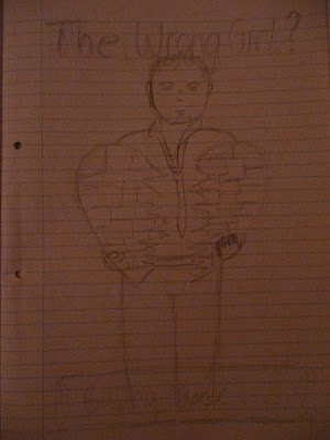

I've been rethinking the title of my film from 'The Other Girl?' to 'The One That Got Away'.
'The Other Girl?' gives the ideology that the male protagonist is having an affair. 'The One That Got Away' has a better connotation with the storyline that the male protagonist chose the wrong girl to marry and let the right one get away. It also provides a clichéd title to a romantic clichéd storyline.
I also need to consider taglines.
I have several so far;
'What happens when your happily ever after isn't so happy?'
'What would you do if you married the wrong girl?
'Find them this Summer'
'Tony Brand made a decision. One year later he discovered it was the wrong one.'
'Everyone has a long lost love... But would you try to find them?'
'Midlife crisis or true love?'
Film Title:
The texts must have a coherent link between them, which includes the title.
To create the title I have been experimenting on Photoshop CS3 with the text tools to create these titles.


This is my first attempt on Photoshop. I made 'The One' larger as it is a vital part of the title which is quite long. The colour is similar to what I have been using for the text in my trailer and will be similar to the colours used in my ancillary texts.
Aqua, as a colour, suggests emotional healing which is representative of the film's storyline.

This is similar to the one before but 'The One' is slightly bigger and the colour is different as purple usually connotes romance and nostalgia.
Draft Layouts:


-------------
Sources:
Friday, 12 February 2010
Audience Research on Film Posters
To begin my research, I used a questionnaire and asked people who were mainly aged 16-20 the questions below.
In the sample, there were 67 people. 30 were male and 37 were female.
- What attracts you to a film poster?
Actors
Colour
Title
Review quote/star rating
Tagline
Images


In my research, the sample said that they were first drawn to the actors in the film. This could be through recognition of the actor or the image on the poster. Title was the second most popular vote and so in my own drafts, I may emphasize the title.
- What do you believe is the most important feature of a poster?
Title
Image of actor
Images relevant to the genre of the film
Tagline
Date of release
Actor/character names
Colour connotation
Billing block

The sample thought 'Images related to the genre' was the most important feature of a film poster for example, hearts for a romance, explosions for an action film. 'Image of actor' was the second popular which in all, means that the images on a poster are the most important features. This means that I'll have to make sure I use the right images in my poster and use them as a main focus point like in the posters I have analysed.
- When you see a poster, what stands out first?
Image
Title
Colour
Review quote/star rating
Awards given/Nominations
Tagline

The image and colour are the things that first catch the attention of the sample. This means that my poster will have to be eye-catching as well as connote the narrative and genre.
- What style of poster do you prefer out of these two?
a)

b)

The chart below shows the percentage of what the people asked preferred between the poster A) 'complicated' poster and B) 'simplistic' poster. As you can see, 57% of the audience preferred Poster A) rather than Poster B) due to the busy style used with the photos.

Sunday, 7 February 2010
Textual Analysis of Film Posters in the Romantic Comedy Genre
Recent Film Posters.
500 Days of Summer
Released - 2nd September 2009
Institution - Fox Searchlight Pictures
Directed by - Marc Webb

This is one of the promotional posters from the film "500 Days of Summer" which I analysed the trailer from earlier.
From the trailer and the poster, I can see that there are coherent styles in the promotional aspects such as the theme of the blue colour scheme and the text font. The blue colour scheme links to the idea of Summer as the season rather than just the other main character, Summer. This is also suggested by the light clouds behind the main image, suggesting a blue sky and a romantic idea. The blue colour scheme also goes against the ideology of how the colour represents a romantic comedy which are usually represented by bold and intense colours like pink and red for example. Blue however connotes a cold and depressed atmosphere which would actually represent the storyline of the film and the atmosphere better than the colour pink for example.
The main image is of the main actor but his face is unclear as he looks down at his t-shirt. This twists the conventions of a main image as it usually shows the audience the face of the actor clearly and shows the emotions that link to the tone of the film. However, he is looking down at the film title and photo-style print t-shirt suggestion an adoration for the woman which links to the idea of a romance. In respect, the t-shirt he is wearing can be seen as the main image/images and creates a sense of romances with the characters emotions within and with the scenery. For example, one photo is of them at the cinema together suggesting they're on a date. There is also another with the two main characters kissing.
The title, in comparison to the quote at the top left, is slightly smaller and your eyes are drawn to the quote which gives the film a good review as well as four stars. This could be purposeful and used to entice the audience to give the poster more attention. The source of the quote is in a smaller font than the actual quote itself which is positive towards the film.
The tagline "Boy meets girl. Boy falls in love. Girl doesn't." suggests a romance that's doomed to fail by twisting the commonly used narrative "Boy meets girl. They fall in love." The bluntness of the tagline suggests that the film is a comedy as well as the quote which also states what genre the film is.
The Ugly Truth
Released - 5th August 2009
Institution - Lakeshore Entertainment
Directed by -Robert Luketic


This is a promotional poster for the summer film "The Ugly Truth".
So far the poster is quite conventional:
- the title is in the centre of the bottom half of the poster
- the names of the actors are above the image of them and at the top of the page so the audience recognises them
- a billing block is used like in most posters and is at the bottom of the page in lighter toned writing than the rest so the attention isn't drawn to that.
The image is a play on the ideology that men love with their penises and women love with their head. This is shown by how the actors are holding the heart: the woman has it close to her head and the man has it below his waist. This also relates to the storyline.
The colour that stands out the most in the simplistic style poster is red which can connote passion and romance. The use of hearts is also iconic and connotes love and romance, and are often used to promote romantic genre films.
I Love You, Beth Cooper
Released - 21st August 2009
Institution - Fox Atomic
Directed by - Chris Columbus

The text style of the poster suggests a teenage romantic comedy with the use of handwriting styled font and graphics to make it look as if it were written on a notepad which presents the ideology a high school crush where the crusher writes the name of who they fancy in their notebook.
The focus point is the image of Hayden Panettiere who plays Beth Cooper. The fact that the boy behind her is slightly obscured by her suggests his character is the one who loves Beth Cooper as well as the fact the title looks like a thought bubble coming from him. The actress is also shown as ‘effortlessly gorgeous’ with bland clothing and little make-up suggesting a stereotype of a high school cheerleader or popular girl. It can also be seen as voyeuristic as Hayden Panettiere is well sought out woman in reality. The crown above the actresses name also suggests that her character is higher up the high school social ladder than the protagonist which may create comedy when he tries to get her to notice him. The broken hearts around the title also suggest comic value as they contradict the title.
The title is also conventional to other traditional film posters as it is in the top centre of the poster. The images are also conventional as they are in the centre of the poster and also look out at the audience. This can be seen as a persuasive technique to get the audience to see the film as the characters look out of the poster which involves and creates an active audience.
The main colours in the poster are blue and an orangey red which don’t connote love or romance. The orange however, makes the title stand out from the lined paper background and the images.
There is no tagline for this poster but on other posters promoting this movie the taglines are; ‘Five little words can change your life’, ‘Still love me?’, and ‘Popularity is nice. Popular girls are not’ which all relate to the plot and the stereotype of a high school crush.
More Film Posters....
50 First Dates
Released - 9th April 2004
Instition - Columbia Pictures CorporationDirected by - Peter Segal

This poster is promoting a film with a storyline set in Hawaii which is suggested by the pineapples and sand in the Polaroid style photos. In each of these images, there is a photo of the two main characters in ‘date style’ situations which relate to the title of the film. In each the female character looks confused which relates to the tagline ‘When your girlfriend has amnesia you have to win her over... every single day’. This provides the film and protagonist with a dilemma within the plot. The tagline is also in the centre of the poster and written in the margin of one of the photos making it look like photos discarded on the sand.
The fact there is a penguin in the middle image suggests comedy especially as it is dressed in a Hawaiian shirt. The poses of the characters in the images also suggest romance and comedy as they are on stereotypical dates but the woman's facial expression looks confused especially in the image on the bottom right.
Annie Hall
Released - 20th April 1977
Institution - Rollins-Joffe Productions
Directed by - Woody Allen

The image on the 'Annie Hall' poster differs from that of the others because it is in black and white and also the main character cannot be seen clearly. This image could portray a photo taken from a far and the closeness of the couple suggests a romance. The tagline 'A nervous romance' also suggests that that is where the comedy will come from.
The poster uses some conventions which seem to be coherently used in film posters as it contains a billboard at the bottom centre of the poster which includes the institution who have produced the film, United Artists, and the age certificicate the film was given, PG. Unconvetionally, the title of the film is featured at the left-hand side of the page, close to the bottom. In other posters I found that the title of the film usually appeared in the centre of the poster, either at the top or the bottom end.
-------------Sources:
www.google.com
http://www.catsandbeer.com/wp-content/uploads/2009/07/poster-i_love_you_beth_cooper.jpg
http://www.posterpalace.com/categorysearch.lasso?-Token.category=comedy
Subscribe to:
Comments (Atom)
