Critical Evaluation for A2 Advanced Portfolio.
The task brief was to create a promotional package for a new film that included two of these ancillary texts; a film poster, film magazine front cover or a website homepage for the film. Out of the three ancillary texts I chose to create a film poster and website homepage for the film. I chose to do the website rather than the magazine front cover because for my AS Media Studies coursework the brief included the creation of a magazine front cover that represented music.
This task also required me to conduct and show research, planning, development, construction and evaluation of my promotional package on a blog made on the site http://www.blogger.com/. This also required me to learn and then use different media technologies within my coursework. This was a similar task to the AS coursework but the AS coursework only required me to research magazines which conventions differ from the one’s I have chosen to produce in my A2 coursework.
In my A2 year, I also had to use different techniques and different technologies than I did in my AS year as well as using ones I had grown familiar with whilst working on my AS coursework. For example, in my AS coursework I didn’t use any video editing software and had no need to use a video camera. However, in both AS and A2 I had to use a digital camera in order to take images for my ancillary texts in my A2 coursework and for my main texts in my AS coursework. Another thing that differed was the forms and conventions from each text although in a magazine, there are different conventions within the front cover, contents page and double page spread. There are different forms and conventions with the trailer as it contains footage from the film and music in order to create an atmosphere and tone based around the genre of the film and the storyline.
Before I began the any production on my chosen texts I had to start my research so I could then continue on to planning. This year I also needed to research existing texts to discover the codes and conventions that are coherent within that text, conduct research on the promotional texts of other films in my genre to better understand how to represent the ideology of my promotional package. This was so, when I was planning and then producing the chosen mediums I would know which codes and conventions to use to better inform and persuade my audience. To do this, I also needed to discover who my target audience would be for my film which would be in the romantic comedy genre. With this in mind, I conducted research through the internet by looking at existing films in the romantic film genre and an online question poll which I set up on my Blog to find out who my audience was. I discovered that my target audience would be mainly women within the ages of 13 and 40.
By looking at existing texts, I was able to discover conventions that were used. I looked at the trailers of numerous films to find conventions that were common of the genre. For example, horror trailers tended to have a darker hue to the lighting and were more likely to become paced faster as the narrative progressed to create tension and suspense. Trailers of the romantic comedy genre tended to be less fast paced with upbeat non-diegetic music. One film, which I analysed the poster, website and homepage of the promotional package, was (500) Days of Summer. With this I discovered a coherent link between the three texts which is a convention of most promotional packages. The colour is normally coherent within the promotional package as well as the text and title.
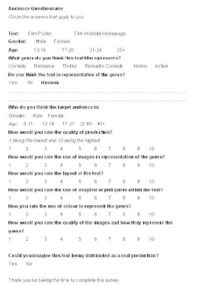
Once I had chosen my genre and found my target audience, I created question polls on my blog to find out the significant information on the most important features of the medium. To get people to answer the polls I posted a link of my blog onto Facebook and also asked people in my class to answer them. This would be so I would be able to get a range of answers from my target audience and be able to do other work while the poll was available. The audience feedback provided me with answers which I then used on the text.
After the construction of my texts, I needed to conduct more audience research to get feedback on my texts to find out whether I had achieved what existing texts did; to inform audiences of the film in a way that they will then be persuaded to see it. To get audience feedback on my poster I printed out a hard copy and than asked people to write comments about it to gain qualitative data. Although this was slightly harder to analyse, it enabled my audience to have more freedom to comment rather than being limited to a multi-choice question.
With the first edit of my trailer, I asked a few people to watch it and comment. A summary of this audience is that they thought the trailer was slow when it should be punchy, and so I made the changes to the trailer to better suit what my audience thought about trailers compared to mine. This also enabled me to make choices in which to better suit my trailer to the romantic comedy genre by adding fast-paced music with a connotation of love, and using colours to better reflect the genre.
Within all three of my media texts I used conventions that I had found when conducting my research on existing products. With my website homepage, the research I conducted helped my discover the following codes and conventions which I then used in my own product; images coherent with the poster, a link to the trailer or the trailer playing automatically as the user enters the site, coherent use of colour and a navigational side bar that provided links to the other pages of the site. I also found another convention when looking at the Valentine’s Day (12th February 2010. Produced by New Line Cinema, Karz Entertainment & Henderson Productions), (500) Days of Summer (2nd September 2009. Produced by Fox Searchlight Productions), websites which I chose to use on my own product; a music player that played music from the film soundtrack automatically. I used this on my own product because in my trailer, I use five different songs which would be available on the film soundtrack. This convergence allows music to be promoted along with a film to then appeal to a wider audience.
One convention I didn’t follow when making my trailer was the use of a voiceover as the narrative enigma. In the (500) Days of Summer trailer, the Bridget Jones’ Diary (13th April 2001. Produced by Little Bird, Studio Canal & Working Title Films), and the Breakfast at Tiffany’s (5th November 1961. Produced by Jurow-Shepard) trailer, the use of a voiceover provides a narrative which is clearer and more descriptive whereas in the When Harry Met Sally (1st December 1989. Produced by Castle Rock Entertainment & Nelson Entertainment) trailer the narrative is shown through text and the acting of the characters in their dialogue. I wanted to follow this convention as I thought it would create more humour than voiceover would. In the Harry Met Sally trailer, text captions are used following footage from the film. For example, the text which is white on a black background, says “Good First Impressions” in reference to the trailers narrative of what is needed in a good relationship. The text is followed by a scene where Harry and Sally have just met and are in the car. Harry offers Sally a grape and sits the seed of his own out of the window. However, the window is closed and the seed sticks to the window. Harry then says that he’ll roll it down. This scene which contains the characters awkwardness creates humour which is reinforced through the narrative of the text. I wanted to recreate this in my own product which is why I chose not to make a voiceover.
While watching and analysing the trailers I discovered another convention was the use of medium close ups and close ups. These shots are used to show the actors and the characters emotions and reactions within the narrative. In my own trailer I used this convention and found it to be effective in showing the reactions and emotions to represent the narrative.
Another convention that I found in existing products and then used in my own product was the use of non-diegetic music signify the change in the narrative structure. For example, in the (500) Days of Summer trailer, the structure of the trailer is separated by the change in the song playing over the visual footage. The change in pace and style of the music creates a sense of atmosphere and in some cases shows the emotions of the character at that point in the narrative.
Trailers often contain quick cut edits to create a fast paced trailer that will excite the audience rather than bore them. Though research and audience feedback, I decided to change one of the main shots in my trailer; where the main character Tony is looking through a bag and finds the letter from his lost love, Hannah. To speed this up, on the editing suite I cut the clip to the beats of the music and cut chunks out so I could then add other footage of the same act but at varying angles and distances and faded some in and out of each other to create a sense of movement and to better show the emotional change of the character.
Music was another form and convention that I found in all of the trailers I analysed. The use of the music to represent the change in the narrative was a difficult convention to use as I had to find the right song for each part of the narrative structure and see if it would represent the structure and blend in with the other music I had chosen. In the end I chose; “Can’t take my eyes off you” by Andy Williams (October 1968, Sony BMG), “I Luv You” by Ordinary Boys (23rd October 2006, Universal Music Group) “One Week” by Barenaked Ladies (22nd September 1998, Reprise Records) and “I’m Gonna Be (500 Miles)” by The Proclaimers (August 1988, Chrysalis). In one of the scenes within the trailer, Tony is singing along to 'Don't Stop Believing' by Journey (1981, Columbia) which has recently becoming a hit thanks to the American TV series Glee which aired in the UK in February 2010.
I chose this selection of songs because my target audience has a wide age range and so music that will be recognisable by each generation will make the film seem more appealing to that particular age group. A few of the songs can be seen as classics and even people in my generation can recite Andy Williams 'Can't Take My Eyes Off You'.
In the production of my film poster, I chose to use a medium close up of the main character and follow the convention which is used in other existing texts that I had analysed. Although in my images I chose to show the character as unhappy and confused rather than happy. This doesn’t follow the usual conventions I found within existing texts however, I chose to do this because it better represent the storyline and narrative of my film. One convention I did follow was with the representation through colour. Although the texts I analysed didn’t follow these conventions, the use of colour still represented the storyline. For example, the I Love You, Beth Cooper film poster contains oranges and whites which has some representation of school with the paper-style background. The orange can also connote passion and desire which represents the storyline of the main character having a high school crush on Beth Cooper. In my own poster, I chose to use the colour pink to represent the romance in the storyline and connote a nostalgic, romantic feel. In my trailer, I chose to put the pink text on a black background to connote a sense of mystery and drama through the differences in the colours. The black also connotes the unknown and fear which can represent the emotions of Tony as he searches for Hannah.
To produce my trailer, I used Adobe Premiere Pro 1.5 and Photoshop CS3 to produce the poster, website homepage and the billing block and title in my trailer. The use of the editing suite helped me create match-on-action shots and keep continuity between shots of the same moment especially in the scene in which Tony is looking through the bin bag of his belongings and finds the letter from Hannah. I was also able to add effects to the clips to better represent and connote the storyline especially in the first scene which is a memory. The light lighting provides a connotation of a dream and the adjusted speed which slows down the clip also connotes a distant memory. Another effect I used on that clip was a dust effect which lightened the clips and created a grainy screen to better connote an old memory.
For full the full analysis of my trailer refer back to the post title “Finished Trailer” earlier in this blog.
What I wanted to be communicated from my trailer was a story about love and hope. I represented this through close ups of the emotional reactions of the characters. Tony, who is the main character, is the main focus of the trailer and so the narrative and shots revolve around him and his emotions within the narrative structure.
Within most promotional packages, there is a coherent link with the texts and because I have used this convention in my own promotional package I feel the combination is effective. The repetitive use of the image of Axel as Tony creates a coherent link between the texts so that the audience will associate one text to another.
With the digitalisation of the media progressing I chose to make a website homepage for the film rather than a magazine front cover which I created in my AS year. The progression of computers and the internet has meant that more people have access to faster broadband and therefore will be a prime market to advertise to. Digitalisation has also meant that the audience can take a more active role in what they see and read as websites can provide more information that a poster or trailer could. Convergence within the internet has also created more opportunities as now multimedia players can be put onto websites that can play music or videos which is why I chose to include a player on my website homepage design. It would also create a good opportunity for the institutions who produce and distribute the music as they are reaching a wider audience or even reaching an audience who wouldn’t normally listen to their music.
Whilst looking at existing websites I found that the newer ones contained more than that of the older ones. For example, the official website for Valentine’s Day contains more information like a gallery and a media player whereas the official Love Actually site contains some information on the film and the trailer. To put the multimedia player onto my website design I had to find an image from another site and open it up onto Photoshop in order to cut it and place it on my own work.
The combination of my promotional package is effective as it would reach a wider audience. The trailer would reach the widest audience as it would be shown on the television in between TV shows and before films being played at the cinema. A poster would reach a large audience as they’d be featured outside in public places. The website would be available to a large audience but may require them to find the site.
The texts, which overall, are intended to inform and persuade the audience to go to the cinemas to see the film. My own texts are quite effective in this way as with the audience response to the surveys I found that my audience found it effective in representing the genre, storyline and institutions ideology behind the promotional package.
When looking at my finished texts I see some things that I would like to improve. For example, I would like to improve the quality of sound and quality of footage as the video camera I used which was a Canon HR10 for the filming of my film trailer. The camera had built in microphone which picked up the sound of the tape in the camera. The lighting in my trailer could also be improved as in some clips, the ceiling light was used because the room was dark but this caused the clip to have a yellowing hue. Although this may have given a warmer quality to the clip, a whiter light would have been better in order to keep a professional quality to the trailer. However, I did not know how poor the quality of lighting was until I had uploaded the footage from the tape onto the college editing suite. This may have been because it was available on a larger screen than the one on the camera. When filming the second time, I had covered a dinner tray in tin foil to mimic a light board which seemed to be effective in putting light onto the actors faces. Unfortunately I was unable to require a microphone so some of the sound was a little fuzzy but because there is non-diegetic music playing, the fuzzy sound isn’t as noticeable.
If I had more time to learn more about website design I would have used the program Dreamweaver to create the website homepage and create working links to one or more of the pages I had planned in my design. I am completely unskilled with making websites and codes for them so if I had made it I would have probably enlisted the help of a friend who does BTEC IT and also used the ‘Homepage Usability’ written by Jakob Neilson (2001). I had used the book in my initial research as well as analysing existing website pages.
Some of my audience feedback on the texts had said that they thought the main character should be more attractive;”Good for comedy value but shame about the lead’s looks.” Of course, if this was a real film the main character would be played by a famous and attractive actor who would bring sex appeal to the role and their fan base.
Some strengths of my texts are the coherent links within them for example which was a convention I had found when conducting my research. The use of colour is a strength as I was originally going to have a blue colour scheme to avoid the idea that it was a story about romance as Tony’s wife leaves him which is very romantic. After I decided against this colour scheme I decided to go for a purple colour scheme which connoted confusion and mystery. However, this didn’t suggest that there was a happy ending or the ideology I wanted to show; the romanticised idea of a last chance with a lost love. This is the reason I chose a pink colour scheme as I wanted to connote romance and represent the storyline as romanticised. I chose to do this to represent the ideology behind the main character, Tony and create a conflicting tension between him and the character Jeremy. Tony has the romanticised idea whereas Jeremy believes he is naive and has a negative outlook. This difference between the characters creates a juxta-position of views which I tried to create in the first scene where Tony is explaining to Jeremy why he wants to find Hannah by talking true love and destiny, by using darker lighting to represent the awkward atmosphere and tension.
To find my audience, I first researched other films in the same genre to see who was the main audience who saw those films. I gathered this research by going onto the sites of the films and looking at forums which were discussing this film. Once I had conducted this initial research I then created a question poll on my blog. I posted the link onto the Facebook site and then waited for people to answer the polls. With this information I found my audience was mainly female like I have stated earlier in this evaluation.
Because I have a wide female audience I needed to think about age restrictions. Comedies can sometimes be classed as an 18 depending on the content and how rude the BBFC finds it and whether they think it is offensive towards the audience. Romantic comedies tend to be a lower classification because they can be targeted at teenagers who are the largest target market for films as they are more likely to go a film at the cinemas or buy the DVD as they have more time during school holidays for example and are willing to spend the money in order to go and see a film with a group of friends. This is why I chose not to contain too much of a rude content as a slapstick comedy has. This was also intended so that the film would be appealing to an older female audience. So that it’d be a perfect date film or one to watch on a girly night in. I intended for the humour to be created by the situation in which the main character is and the juxta-position between the characters that are caused by conflicting ideologies. The language within the film is intended to be simple and not as full of slang so it will be understood by a variety of age groups. The language is also meant to be representative of the genre and the characters attitudes. This is shown though mise-en-scene and the character performances. For example, Tony has a romanticised and naive attitude. His speech is based around fantasy ideologies like true romance. Jeremy on the other hand has a colder attitude which is shown through his dialogue which is mainly sarcasm.
Cinematography also represents character for example in the memory scene of Hannah where the lighting is bright and I used a handheld camera to represent a point-of-view shot to show a memory of someone. This is also shown though the actress’ performance as she is looking at the camera with a sweet and innocent expression which can be seen as flirty. The effects used on this clip also create the idea that it is an old piece of film and a memory.
The ideology behind my film is represented well in the title of my film and the logo I made on Photoshop using the text tools. The film logo is a coherent link within my film promotional package as it is used on the trailer, poster and the website homepage design. The colours within this represent the ideology of the genre and the coherent link within the promotional package means that the audience will associate the texts with one another and associate the film as a romantic comedy.
The film will be enjoyed by the audience and make them feel good which is a gratification and the information they gain is the uses. Blumier and Katz (1975) also identified four main uses of the media;
- Surveillance - the audiences need to know what is going on
- Personal relationships - the audiences need to interact with others
- Personal identity - the audiences need to define their identity and sense of self
- Diversion - the need for escape, entertainment and relaxation
Personal relationships - My texts contain characters that the audience can either relate to or form a virtual relationship with. This could be through empathy with the character Tony when he is thrown out of his home by his wife, which will then have the audience rooting for him to find Hannah and have a happy ending.
Personal identity - Characters within my texts will be judged on by the audience watching them. The audience will develop a hatred for the antagonist Alison and an admiration will develop for the protagonist Tony. My target audience is also those who like romantic comedies that hold to the same beliefs and ideologies they have. This is also known as value reinforcement where the audience chooses media texts that have similar beliefs to them.
Diversion - the humour contained within my narrative is intended to help my audience to relax and escape reality like other media texts.