Trailer:
Blogger Upload:
Youtube Uploads:
Teaser Trailer:
To collect audience feedback on my trailer I created a questionnaire for people who had seen it to fill out. This was a focus group of 20 people mainly in my target audience.
The feedback I received was mainly complimentary with most of the ratings being 8's, 9's, and 10's on the rating questions.
Although the focus group thought that the sound quality was poor in the scenes containing dialogue which is because of the background noise of the tape in the camera.
Some of the qualitative comments were "I wish this was a real film" and "I want to know what happens" which means that I achieved the main aim of a film trailer; to persuade the audience to see the film.
However, I did come across with some difficulty when receiving audience feedback as the audience who answered the questions in order to give their feedback had to have access to with my media blog or Youtube. To try and get past this disadvantage I posted links to the videos on to the social networking site Facebook in order to get a larger sample.
This caused a problem because many of the people I am connected to on Facebook are between the ages of 16 and 40, and are male and female. This meant that may main target audience wouldn't be the main target of the feedback. However, this problem didn't seem to come across in the feedback which was mainly positive.
Film Poster:

As a starting point of my audience research to gain feedback on the finished poster, I printed off a copy and asked people to comment on what they thought about it. This was to gain qualitative data which would be able to collect more opinionated answers rather than answers from a multiple choice section which would limit the choice and audiences answers. Although this was more time consuming than handing out a survey, I was able to get a fuller range of feedback.
The overall opinion was that it was eye catching, showed the story well and looked as though it could be a real published poster. One comment written was "...it is more eye-catching and I understand straight away that it is a romantic comedy based on (Tony) who is confused about which girl to be with." shows that the basic plot of the story is understood though the representation and ideology shown though the images, colours and layout of the poster. Another comment was "good for comedy value" which was in reference to the character asking of the main character Tony, played by Axel Billingsley, and his facial expression on the poster. This challenges the convention of the actors/characters smiling in the poster which I found in the existing texts I analysed. I chose to do this to better represent the ideology of the storyline. Another comment suggests that I have succeeded in this; "Expression shows love is turmoil and not all sunshine."
As well as collecting qualitative feedback, I also handed out the survey below to people and showed them either the poster or the website homepage design. I had printed both out in colour so they were able to see them.
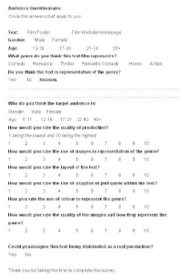
Once I had a sufficient amount of surveys filled in, I began collecting the data for analysis.
In this survey, the audience feedback was good with an average rating of 9.2 on each of the rating questions. All the people who filled the questionnaire said that they could imagine the text being a real production for a real film.
Some commented on the good representation of the genre and thought this was because of the facial expression of the actor in the main image.
Website Homepage Design:
Collecting audience feedback on the website was slightly harder than the other texts as it wasn't a real website that they could use, it was just an image at the time. I told people this as they wrote comments on this and so they took it into account. Some said that they would have preferred to have seen the trailer first which was a convention I had found when looking at existing texts; the trailer played automatically as you entered the site.
However, the majority of people thought that is was a good representation of the film and kept a coherent link with the other texts (if they had seen all three finished texts).
"It's good because there's music from the soundtrack playing which is also promoting that" was one comment that I found in reference to the convergence of the music media player featured on the website.
One comment said; "the face draws you in so you know what the websites about straight away."
Some people didn't regularly go on sites as shown in this comment "I don't usually visit film sites but it looks easy to navigate through and has stuff expected to be seen on the site."
I also handed out the survey with a printed picture of the website homepage and asked people to fill them in like I had before with the poster.
I had similar results to the film poster apart from the fact that some commented that they don't often go on film websites and so wouldn't know. They did however think it was a good representation of the film and would go see it if they saw this website, much like the feedback from the film poster.

No comments:
Post a Comment