Sunday 31 January 2010

Ancillary Texts

As well as the trailer, I must also create two of these ancillary texts:
  • a magazine front cover featuring the film

  • a poster advertising the film

  • a homepage website for the film
To gain more understand of each of these ancillary texts and to help choose between the three, I will conduct research into each text before making my decision and apply LIIAR to each.


Magazine Front Cover.

L - Language

The main image on a film magazine front cover is usually a key convention and feature used through out the genre and usually shows the main actor/character of the main film being promoted in the magazine. The magazine audience will usually recognise the actor on the front cover in order to influence to buy the magazine especially if the consumer is a fan of that particular actor or film.

The Dark Knight was a highly anticipated film of 2008 and made even more popular as it was Heath Ledger's last and legendary performance. Using Ledger in costume would have been a good example of how the convention is used.

I - Institution

The institution is the publisher of the magazine. For example, Bauer Media who publish Empire, Grazia, more!, Zoo, Mother & Baby and many more.

I - Ideology

The ideology is usually the ideas and opinions of the institution. This will be the review from that magazine and the interviews featured.

A - Audience

The audience is the target and main consumer of the magazine. The magazine will usually contain key features or concepts to entice the audience to buy the magazine. For example, some magazines provide 'freebies' in order to sell the magazine to a larger audience.

R - Representation

With the magazine above we can see that the representation of the magazine is shown through images like the main image of the Joker and the headlines. From this we can tell that the magazine represents films rather than beauty through the use of the main image which is used in the posters advertising the film. The face paint Heath Ledger is wearing is iconic of the character from Batman and the gun he is holding also shows the connotations of violence which were featured in the film.
Film Poster.


L - Language

Language is usually shown through connected images or one main image as well as colours and taglines like the one above in The Dark Knight: 'Why so serious?'.

The main image is a face graffited on a wall. The graffiti connotes anarchy which is part of the main characteristics of the villain, the Joker. The lips of the face is made in the shape of the Batman logo which is iconic of the franchise and so will be a key feature to show what this film is about.

The dark colours suggest a seriousness to the film as well as violence which is shown through the red paint which could signify blood. This sets the mood and tone of the film.

I - Institution

The institution is usually the film companies who produce the film. The logos are usually featured on the poster and on the one above, the logos are featured along the bottom of the poster: Warner Brothers, Legendary and DC which holds the rights to and were the creators of the Batman franchise.

I - Ideology

The ideology behind a film poster is to create hype for the film conveyed through the language and representation on the poster. The main idea is to inform and persuade the audience and to create anticipation for upcoming films.

A- Audience

Film posters are usually mass produced and made visible to a large audience with posters on the side of buses or on billboards. This is to help entice those who aren't die hard fans of the franchise and who haven't been kept up to date by magazines or the internet.

R - Representation

The genre is usually represented on the film poster as well as the actors starring in the film.

Colours usually set the tone of the film (eg pinks and reds for a romance, dark colours and reds for an action film) and the actors portraying the characters, their emotions setting the tone too (eg serious for a thriller, happy for a romantic comedy).

Film Website Homepage.


L - Language
Each text from the same film have similar features; colours, images, text/taglines.
The website usually contains the trailer for the film as well as options only available online. For examples; games, sign ups for newsletters, and an option to enter the site which leads to more links.

I - Institution
The institution, the film companies, are also featured within the homepage and sometimes even in the website address like the example above. There is also a link to the film companies main site featured somewhere on the page.

I - Ideology
The ideology is similar to the other two texts; to inform and persuade the audience to see the film.

A - Audience
Because this is on the internet it is available to a much larger audience and allows them to become active in the way they can chose when to view the trailer or find out more about the film. This convergence has allowed wider and cheaper publicity for films in recent years.

R - Representation
Again, this is similar to the other texts as it wants to promote the film.

--------------
Sources:
www.google.com/images

Finished Trailer

Analysis of Trailer

The trailer starts with a memory. I decided to show this through different effects as well as the setting of the scene; a park. This setting is used to represent the ideology of a past memory and nostalgia as well as innocence. The effects I have used with this clip also help to add to this idea. I have slowed down the speed of the shot and added a grain effect to better show the audience that this is a memory. The voiceover from the main character - which also acts as a sound bridge between the memory and the dining room scene and introduces the main character - supports the idea of a memory that he is telling his friends. The fade between these two shots reinforces the ideology of a dream or memory and suggests the narrative is coming back to the present.

The non-diegetic music playing in the background of the memory scene is ‘I Can’t Take My Eyes Off You’ by Andy Williams. This is an old and classic love song with a slow-paced introduction which I thought would suit the narrative of this beginning scene.

Humour is intended to be created through the character performance from the main character’s friend, Jeremy and his reaction to Tony in this shot-reverse shot. There is then a close-up of Tony to show his disheartened reaction. This quick exchange is intended to show the audience the main character’s idea which is the narrative of the trailer, and Jeremy’s attitude towards it.

Another non-diegetic song begins to play to introduce the text title and the name of the character. The colour pink is used to represent the genre of the film. In this title the text is centred and together which differs from the others in the trailer. This is because the titles after the disruption within the narrative as he loses his job and wife in the same day which changes his everyday routine and provides a barrier that he must overcome. The disruption within the narrative is reinforced by the change in music from a the Ordinary Boys ‘I Luv You’ to a faster, more upbeat song by the Barenaked Ladies called ‘One Week’ which is about a break-up. The change in the title style also helps show the audience this. The text becomes diagonal to show the disruption.

From 00:22 until 00:39, mise-en-scene is relied on to show the narrative as props are used to show that Tony has lost his job – the desk plant and box of stationary and papers. The bin bag thrown down is another use of props to provide the narrative of Tony being kicked out. This is then reinforced by his wife slamming the door in his face.

The next shot is a medium close up of Tony singing and drinking from a glass which is used to suggest he is drinking whiskey. The lighting in this scene is dark to reflect the characters depression and create an atmosphere. In this scene another shot-reverse shot is used to create humour at the reaction of the friends he is staying with. The non-diegetic music starts again at the end of this shot, similar to that used earlier in the trailer. This repetition is intended to create humour.

The medium shot in which the characters are playing Scrabble is intended to create a homely and slightly classic atmosphere which Tony is intruding on.

The next scene in which Tony is emptying out the bin bag of his belongings and finds the letter, contains a series of close ups that start from a high angle and slowly become low angled shots. This is to show Tony’s growing confidence now that he’s found Hannah. The cut-away shots of the letter which are transitioned over a medium close up of Hannah create a connection between the letter and the earlier shot of Hannah. This continues the narrative and shows a change in the storyline.

The non-diegetic music changes again to ‘I’m Gonna Be (500 Miles)’ by The Proclaimers. This music signifies the journey that Tony is about to start and the singing of the song kicks in when he’s looking through phonebooks in order to find her.

The scene before this shows an exchange and Tony telling his friends about a phone conversation. The quick shot-reverse shot technique that is used shows the conversation which is happening in different places. Tony and Alison are on different sides of the shot to represent this too.

To end the trailer, there is quick editing of medium close-ups of the cast which is a convention I had found when analysing other film trailers. There are also titles that I created on Photoshop (the film title, billing block and soundtrack information) that were similar to the conventions that are in film trailers. There is also a title for the release of the film with the tagline 'Search for it, Summer 2010' which directly refers to the narrative of the film and informs the audience of the release date.


Teaser Trailer:

I also created a 30 second teaser trailer. This would be distributed a month or two before the full trailer like the one above so audiences will become curious about the film.


The trailer contains a similar sequence to the full trailer in which Tony is being kicked out by his wife. This sequence creates a sense of hopelessness and mystery as it shows the audience him being kicked out but not what happens afterwards.
The text captions are intended to create humour and a juxta-position between the stereotype of a wife kicking a husband out and the humour created with the perfect life collapsing.

The trailer also introduces the main character, Tony as the protagonist and the close-up shots reinforce this. We also see the antagonist is introduced and the mise-en-scene in the shot where Alison is throwing Tony's stuff out also creates this. For example, she is wearing a red dressing gown which suggests that they live together as well as the colour connoting danger.

There is also an enigma created within the narrative of this 30 second trailer as it leaves the audience wondering why the protagonist has been kicked out, who the other girl is and how is he going to get his life back to normal because of this disruption.
Friday 29 January 2010

Trailer - Editing and Refineing

First Edit:


Because this is a first edit, final touches like film production company logos haven't been edited into the trailer yet but instead I have used some text to show where it would be in the final edits.

I have also used text to highlight where I'm going to refilm due to poor sound, lighting and to use more shots in order to make the trailer 'punchier' as at the moment it is a little slow.


In the 'Going to Work' scene I want to use a close-up of the goodbye-peck-on-the-cheek to show the married couple. This may be difficult because Marianne, who plays the wife, might not be able to make it on the day I've scheduled refilming.


I may also rename the film something like 'The One That Got Away' which links more with the narrative than 'The Other Girl?'


Titles:

In my trailer, there will be text to give the audience information about the film; the release date, production information and title.


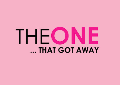
This is the title I will use in my trailer and also the ancillary texts to keeps a coherent link between the texts. The colours represent the genre of the film.

I made this on Photoshop which is what I will produce my ancillary texts on as well. This can also help me keep a coherent link between the ancillary texts as I will be able to easily go from one to the other.


I also made this billing block on Photoshop. I used the same font 'Birch' and adjusted the size of the font depending on the text for example, the names are in a larger text than the titles.

I created the logos of my production companies which is a convention I found when looking at the trailers in my research.

Most of the names used in the billing block are either made up or a friend of mine.
Edit Log Sheet:
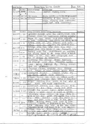
The sheet below details all the times I was on the editing suite using Adobe Premiere Pro 1.5. It also details what I did while I was on the editing suite and the changes I made over the five months I was editing. It is only a brief account and will help me when writing my evaluation as I will be able to see what I had done.